Two independent dyslexia font research show that kids with dyslexia read faster, make fewer mistakes and spend less mental energy when reading text in the OmoType.
Learn more about OmoType, benefits and how to download it for free.
Read below just an extract from our whitepaper on legibility research or download the full report.
DOWNLOAD THE WHITEPAPER FOR FULL REPORT
Reading is a complex skill, but also a prerequisite for success in our society. We receive a great deal of information in writing. Just like bike riding, reading is a skill that needs to be mastered. But, the more we get on a bike, the more proficient we become. The same applies to reading. We have to read a lot to acquire reading skills.

To our surprise, reading assignments show the poor performance of children worldwide. PISA 2018 test results (9) showed that two-thirds of children from the USA are not proficient readers. Two out of three children in the USA failed to meet the reading proficiency standards set by the National Assessment of Educational Progress (7). It seems that many of us have reading difficulties. They are not only the problem of those who suffer from a reading disorder – dyslexia.
To learn how to read, you have to master several skills, such as:
In the process of learning to read, a crucial step is learning how to connect the letters to their corresponding sounds.
Learning to read is a process. The crucial step is learning how to connect the letters to their corresponding sounds. This is precisely what seems to be the core problem in dyslexia – decoding or mapping letters onto their sounds. Dyslexia is a language-based learning difficulty. To be more specific – a phonological disorder.
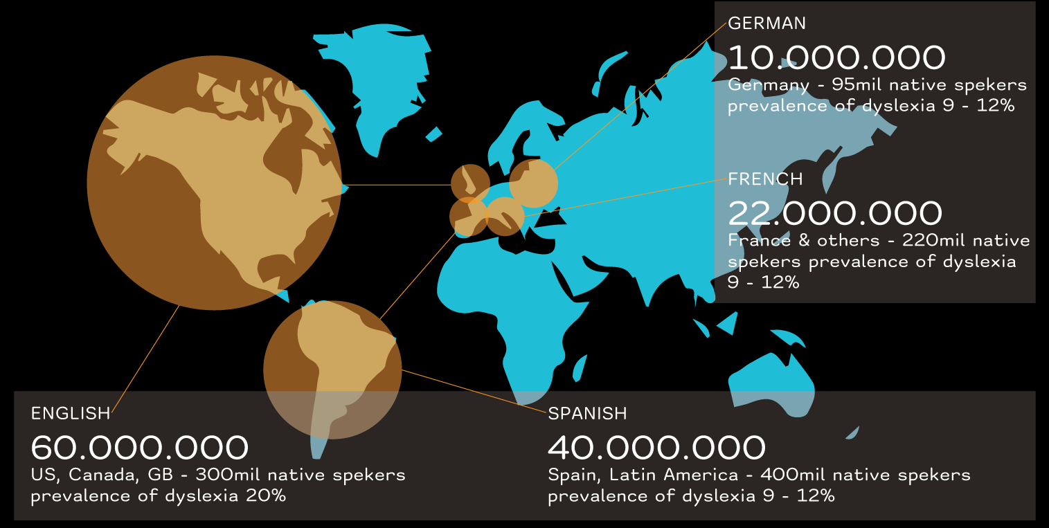
In English-speaking countries around 15-20% of the population has learning disabilities, and 70% of them are connected with dyslexia (4). In Europe, due to different language systems, approximately 9-12% of the population has dyslexia (3). To overcome these difficulties, children with dyslexia need to be identified early and included in structured literacy programs.
Fonts present reading interfaces. It is well known that people prefer certain fonts over others. Some find the shapes of letters in certain fonts to be more appealing and easier to read. This is why we came up with the idea of creating a more readable font. Not only for people with dyslexia but for all people who struggle with reading.
Research on the impact of fonts on the readability of texts in people with dyslexia is a relatively new area. So far, the results have shown that the type of font affects text readability in people with dyslexia. In addition to that, some dyslexia associations recommend fonts that are more readable for people with dyslexia.
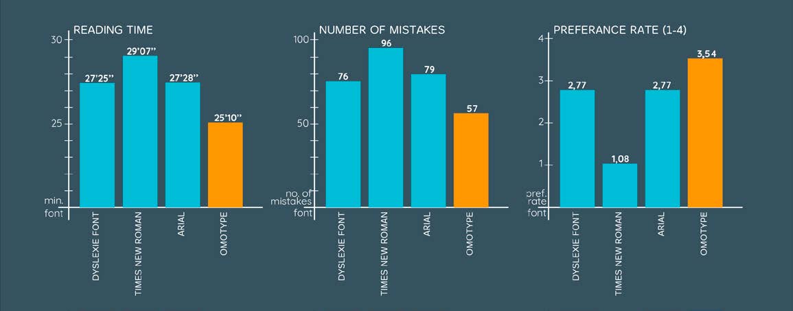
The results from these studies suggest that children with dyslexia read faster and with fewer errors the text written in the OmoType font than in any of the other two specialized fonts for dyslexia – Dyslexie and Open Dyslexic.
Furthermore, according to their visual preferences, they prefer to read texts in OmoType. The result of the eye-tracking research is particularly interesting. Children with dyslexia appeared to have shorter fixations while reading texts in the OmoType font. These results indicate a higher readability of texts written in this font, which ultimately leads to a better understanding of the text.
DOWNLOAD THE WHITEPAPER FOR FULL REPORT

