Research shows that with OmoType, dyslexia friendly font system, dyslexic kids read faster, make fewer mistakes, and use less effort to read.
OmoType has 240 different styles that address the needs of the entire spectrum of dyslexia manifestations.
Our typographers, science, and dyslexia experts used relevant scientific research about font readability and dyslexia to develop OmoType. It is free for personal use so feel free to reach out to us for a download link.
Dyslexia Friendly Font Improves Letter Detection and Recognition
All letters are unified and without deformations which improve readability
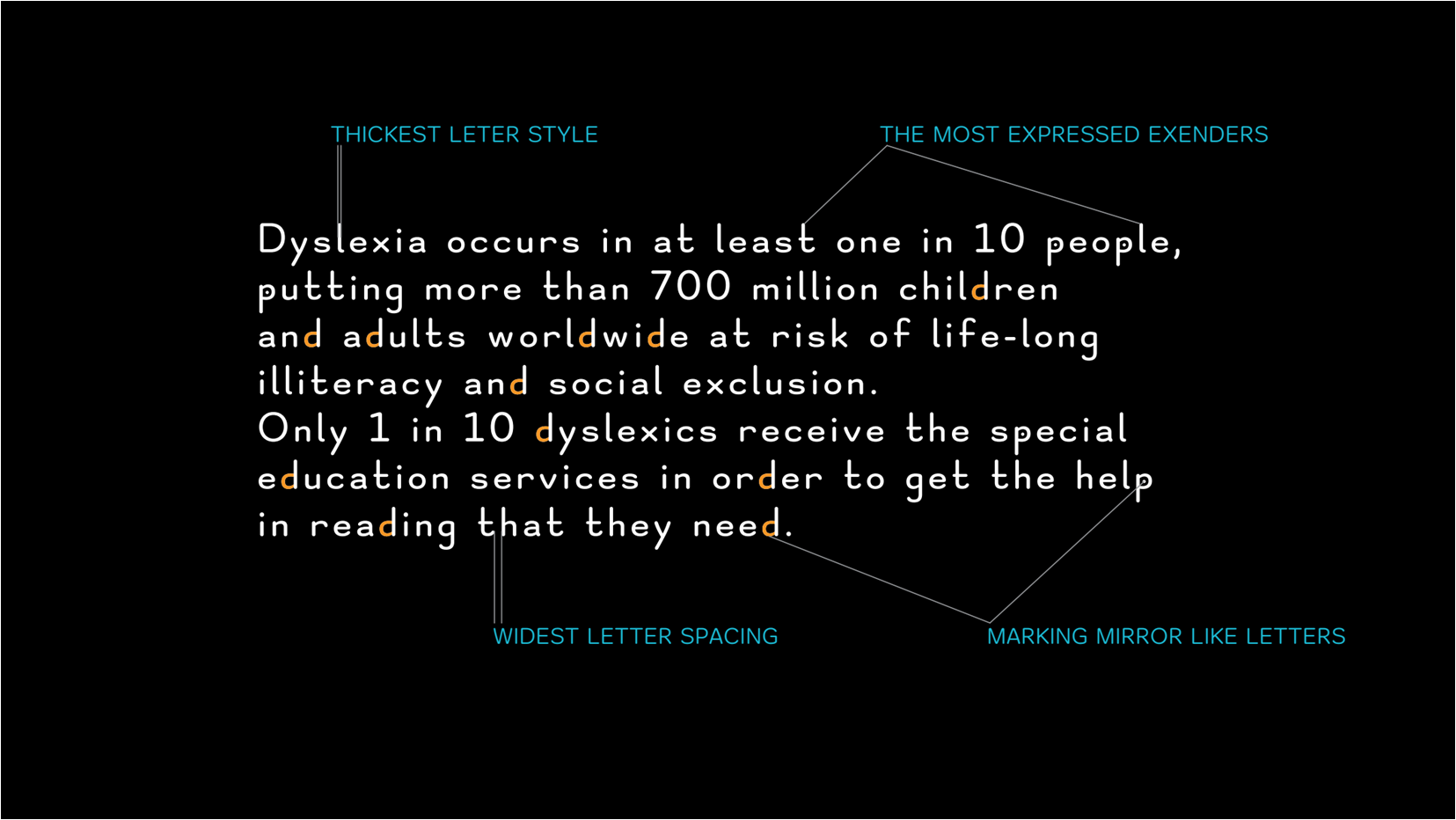
Fonts come in different weights and space sizes between letters
Extended ascenders and descenders for reduced oscillations during reading
Uppercase letters are emphasized so it would be easier to differentiate them with other letters
Easily Recognize Shapes and Avoid Mental Rotation
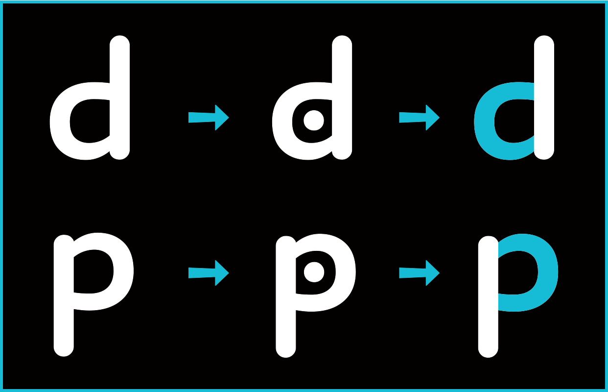
Similar shapes have recognizable elements so it is easier to differentiate them. Also, circular shapes are designed to avoid symmetry and endings are emphasized and extended.
Dyslexia is highly individual. That’s why the reader can mark letters that are symmetrically opposite and avoid confusion during reading.
OmoType Dyslexia Friendly Font Performs Better Than Any Other
A speech therapist in cooperation with Dyxy, a regional association for children and young people who are manifesting difficulties in reading and writing carried out the tests. Just one version of OmoType was tested on a group of 15 children with dyslexia aged 10 to 14. Other fonts used in this testing are Dyslexie font, Times New Roman and Arial.
Children with dyslexia read faster, made fewer mistakes, and preferred OmoType more compared to other dyslexia friendly fonts.
After that, we validated our solutions at the Faculty of Education and Rehabilitation Sciences. They help us gain a better understanding of dyslexia and the value of our tools.
With OmoType Dyslexia Friendly Font Kids Need Less Mental Energy To Read
The last research was with a group of 4th graders on OmoType (only one version) with an eye tracker. Results show that children use the least mental effort to read with OmoType. This conclusion is based on the shortest time of fixations recorded with OmoType.