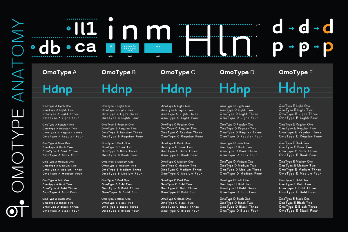
The OmoType is a highly readable font system that enhances the legibility and readability of the text. Its features have proven to facilitate reading, improve letter detection and recognition.
It is amazing for software solutions for dyslexics and people with reading difficulties. The reason is its dynamic ability. That means you can implement text adjustment properties and enable manipulation of fonts and text.
That makes it ideal to be a standard (dyslexia) font for web accessibility.
OmoType's effectiveness is validated in scientific research and in practice. Dyslexics read faster, make fewer mistakes, and use less effort than with other fonts.
No other font has similar effectiveness and the ability to personalize content for your own needs.
Dyslexia is a specific learning difficulty with a core problem in phonological processing. People with dyslexia have problems with matching the letters with the sounds of those letters and the combinations that letters make. They have trouble with reading, spelling, writing, and reading comprehension. These problems can influence learning and overall success in education.
Another challenge is the spectrum of dyslexia manifestations. For instance, in a room with 100 dyslexics, it would be hard to find a couple with identical manifestations. Because of that, the solution needs to enable different font choices and text setups. Therefore, OmoType is developed with 5 different styles that along with other readability features cover a wider dyslexia manifestations spectrum.

Often one of the main choices for web accessibility solutions for dyslexia we see implemented the Open Dyslexic. Font with the right name, that is free and hence quite practical. However, Rello and Baeza-Yates (2013) did scientific research which tested its efficiency. Results have shown that it doesn’t have any effect on reading speed. You can find similar conclusions in a few other studies.
To compare the efficiency of OmoType and other dyslexia-friendly fonts and optimize it, during its development, we did a couple of studies. In the first one OmoType is compared with Dyslexie font, which is identical to Open Dyslexic, among others.
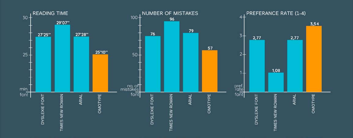
Then a study with an eye tracker tracked reading parameters like number and duration of fixations and reading time.
Both studies showed advantages of the OmoType compared to other fonts. In practice, it is often used and recommended as a go-to font for dyslexics.
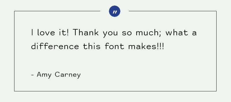
So studies show it provides huge benefits for dyslexics. This is something we often hear as feedback from different age groups who use our font daily.
OmoType is simply the solution that helps everyone read easier.
In conclusion, that would make it the only acceptable font for web accessibility for reading difficulties.
Compliance with most of the guidelines should be done in the website design and development phase. Web developers can use it to do a custom solution. Another option to choose our cost-effective web accessibility widget that makes a website compliant with the readability guidelines faster.
We’d be happy to see you choose to be a facilitator of an inclusive digital society. Show that you understand, respect, and support differences.
Learn more about ReadAble.